My Design & Thinking Process
To all designers who design for web you should always start with these things called your mind & eyes first, ALWAYS. (Sorry if blunt I was educated not to have a filter on my mouth. I speak my mind)
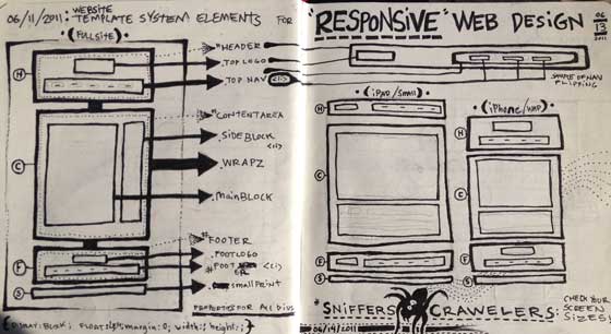
Ask questions to find what the clients wants from there website, the look, the feel, the goal/mission. After getting this knowledge then pick this thing called a pencil up. It DOESN'T MATTER IF YOU CAN DRAW BOMB or NOT. Anyone can draw lines & turn lines into boxes.
 The basic shape for a wire frame sketch is a rectangle, if you can't handle busting a few of those out on paper to get a plan for the flow of information you really need to rethink the game your in. I use to think web design was just to design what you think is best for the client after meeting with them and hearing their thoughts. It's not just that you have to think about everything from what the brand look is if they have a brand. Then how to present all the content or lack of content they have the correct way to engage their users & keep them on the site & hopefully drive to the click thats a purchase or email address. Also what age range is our target user of the website? SHIT! i just got stressed. This is where using the pencil or pen(i use both, pencil first then ink ideas) helps so much in planing how to attack all those questions.
You Have to Focus on Your Design!
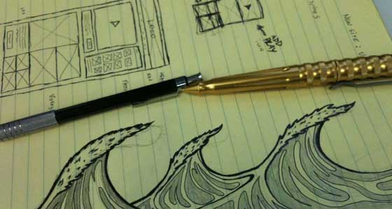
Now that your pencil is in your hand & eyes are on the paper you can begin sketching ideas. This also keeps you from clicking around on social networks or other app windows like netflix pulling your attention from how the hell do you approach this website design & content flow? this way? or that way? You could spend hours throwing shit around on screen in photoshop or illustrator before you get lucky & pull a design out of your butt you remembered you seen or are currently jacking AKA getting inspired from that cool new site you liked. WRONG, bad idea and waste of your time. Start to sketch out the ideas of mini layouts in little thumbnail sizes will save you HOURS of mind racking. After you've taking some time & sketched a minimum of 3 thumbnail ideas, shoot them with your cool iPhone/droid, email them to you or pull it from your photostream, or whatever.  Then hit that favorite app icon on the macbook pro or bad ass mac pro or bomb ass dell however you roll & you are good to go because you have something to start from this thing called a PLAN. As you create on the computer the design will change from your original sketch some but don't worry that's design it changes as you develop throughly thought out ideas. That is the way I love to create web design. By starting with my pencil & pen and some paper first everyday. I enjoy helping my clients find solutions to their objectives & challenges by using my mind, eyes & pencil/pen.

